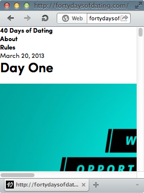
I was chatting with some friends in IRC trying to debug this strange issue reported by my friend Brian Brennan. (I’ll write about that some other day, perhaps, but if you’re truly curious you can check out Bug 920342). Celebrated Medium author Jenn $chiffer then pointed out another site to me that does something similar: http://fortydaysofdating.com/.
If you happen to visit that site from a desktop browser, feel free to resize the viewport and ooh and aah at the amazing content breakpoint transformations. It’s really well done. And then, right around 480px wide, you’ll see this interesting suggestion. If you’re using the Chrome browser (as all proper Lady Gaga fans do), you can even resize it as small as the browser window will allow, 320px:
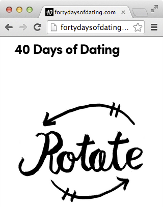
Believe it or not, rotating my Macbook didn’t fix it. :(
So let’s look at the code that is responsible:
/* 320px and greater (iPwn portrait) */
@media only screen and (min-width: 320px) {
  #mobile_portrait {
    display: block;
    width: 100%;
    height: 204px;
    position: absolute;
    left: 0px;
    top: 125px;
    background-image: url('img/spinny_phoney.png');
    background-size: 250px 204px;
    background-position: center;
    background-repeat: no-repeat;
  }

#content, #masthead ul, footer {display:none;}
}

/* 480px and greater (iPwn landscape) */
@media only screen and (min-width: 480px) {
  /* ...turn everything back on */
(I’d just like to state for the record that the “iPwn” comment is straight from the site’s source. I don’t get it either.)
So the deal is, if your viewport is 320px wide you’re an iPhone and you get an image telling you to rotate your iPhone meanwhile everything useful gets hidden. Killer UX. 480px means it’s an iPhone in landscape mode and you’re finally prepared to take in the story of… I actually have no idea. Dating advice or something.
Now let me blow your little minds, dear readers:
Opera Classic™ allows you to go even smaller. Suddenly the rotate graphic is gone and you find yourself in the midst of a nether breakpoint where anything goes (and frankly it feels a little weird. Maybe even a good weird?).
So remember kids, be very careful what you do with min-width. It’s powerful stuff.
But I shouldn’t complain too much. At least you can see the content without trying (and failing) to rotate your laptop.