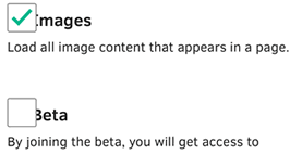
Bug 1078393, with the ever so descriptive title ‘Images’ and ‘Beta’ text is cutoff in Wikipedia, describes a problem with the mobile Wikipedia settings checkboxes displaying incorrectly in Firefox OS, like so:

A friendly Wikimedia developer mentioned that they’re using a custom technique to style checkboxes (inspired by this blog post from a few years back), but mentioned that there’s no problem with Firefox Desktop. He says the problem is that we’re not letting the (hidden) input stretch to the declared width which causes the mis-alignment and overlapping of the custom-styled generated content checkbox thingy.
OK. Let’s check out what’s going on in the user agent stylesheet for forms (that’s the built-in CSS file that defines how form elements display by default) of Desktop and Firefox OS/Firefox for Android, ignoring basically everything except for height or width properties.
input[type="checkbox"] {
  ...
  width: 13px;
  height: 13px;
  ...
}
Firefox OS, Firefox for Android (different source files, but same result):
input[type="checkbox"] {
  max-width: 14px;
  max-height: 14px;
  border: 1px solid #a7a7a7 !important;
  ...
}
So the reason it works in Desktop, but not mobile Firefoxes is because the latter set a max-width property on checkboxes. The simple workaround to the Wikipedia bug would be to set a max-width in addition to a width.
And if you check out this demo I stole modified from the aforementioned blog post in Firefox OS or Firefox for Android, it’s easy to see how mobile Firefox browsers really struggle with this technique. I’ve removed opacity: 0 and added an outline (because of that !important border declaration in the UA style sheet. 💩) to make it extra clear. (Here’s a screenshot for those on Freedom-hating platforms (and non-mobile readers)).
So without adding max-width or max-height it does work. It’s just the version of working that requires you to guess where a hidden checkbox is (and have fingers delicate enough to use it).
But given that Chrome Mobile, Mobile Safari, Opera Mobile (Presto) Classic™… and probably more don’t need the additional max-width to work around their UA style sheets, I wonder if we could get away with removing it. We might just fix who-knows-how-many custom styled checkboxes out in the wild in the process of doing so. Or all hell might break loose. Only one way to find out.